.png)
SORA Studio
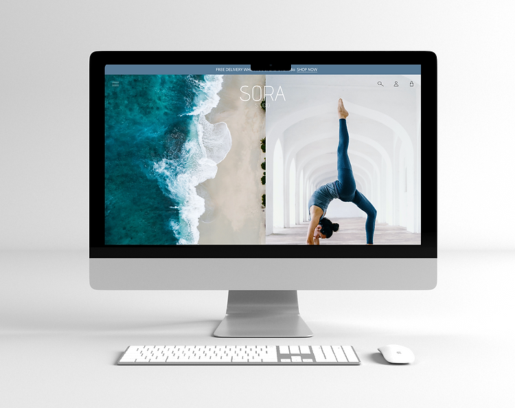
Athleisure brand SORA Studio create minimal, chic designs for working from home to school drop off and squeezing in a yoga class. Their aesthetic is minimal and effortless which their website needed to reflect.
Fitting design to brand identity
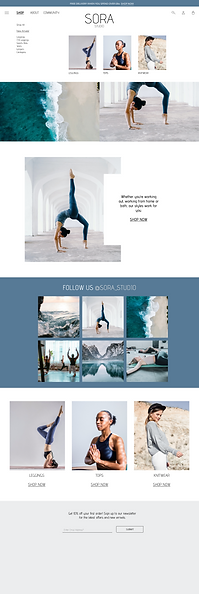
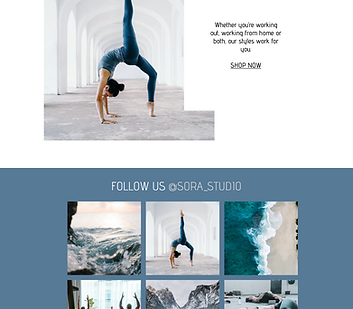
In this case study, it was important for the website to really match the brand identity. In this case, simple, minimalistic but still representing quality. A key USP of this brand is the cohesiveness of the colours and aesthetics of the products, highlighting that they work as one colour palette.

Competitor and Consumer Research
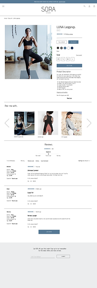
For this project, I was not looking to create a groundbreaking website design, instead I followed typical affordances to ensure that the website was easy to navigate. I did this through extensive competitor research, noting the common elements included within athleisure ecommerce such as the ability to select multiple colours and lengths easily, the categories to shop and the helpful 'you may also like..' sections to help 'build' an outfit.
I also carried out consumer research on these competitor websites to discover what was useful. This research highlighted the need to be clear about certain design features specific to sportswear such as selecting a legging length on the product page (as opposed to it being a different product listing entirely), the need for reviews that suggest the overall fit of the products, and the desire to have matching products prompted nearby.
Customer Journey & Flow
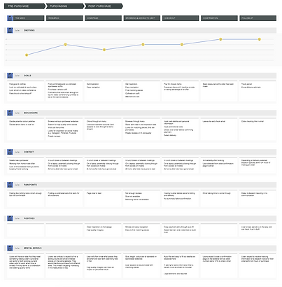
After completing the customer and competitor research I created a customer journey map that would then lead on to a more detailed user flow containing each of the screen states that the user would likely experience following this use case.
A couple of key pain points are highlighted on this journey after being noted in the research. The first is the expectation to be prompted with matching items rather than having to go looking for them and the second is around payment and having to enter details only once.
Prototype Development
.png)
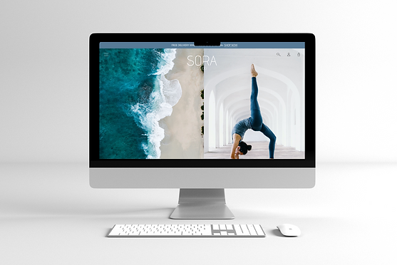
The final stage of the process was creating medium fidelity, interactive prototypes for the most likely use case and further testing them to ensure that the flow worked as expected. As always, I started with very informal low-fidelity sketches and post-its to create the overall product pages before using Figma to creative the interactive frames.
Further development for this website includes creating mobile prototypes.